
Football
Premier League kits 21/22 Ranked
All of the Premier League kits 21/22 ranked
Premier League kits 21/22 Ranked
The new Premier League season is just around the corner which means it’s time for the Premier League 21/22 kits to be released. It is moment of excitement for all fans when a new kit is released and the standard of football shirts has certainly risen in recent years so expectations are high. Kit announcements are a great way to stir up excitement ahead of a new season and can often stir up debate between fans on social media about whose is best.
There has been some amazing Premier League kits throughout the years but there has definitely been a fair share of dreadful ones as well. The standard of kits this season is certainly high but it definitely follows the historical trend with a few bad shirts in there as well.
In this article I take a look at all the Premier League 21/22 kits and rank them from worst to best. (Disclaimer- I have not seen any of the kits in the flesh so rankings have been solely based on images made public by the clubs.)
20. Crystal Palace
At time of writing Crystal Palace are still yet to reveal their new home kit.
19. Newcastle
Apologies Newcastle fans but this kit is poor. I am not a fan of betting sponsors on football shirts in general but this sponsor takes up far too much space on the shirt. I don’t like the buttoned collar either. If the buttons were blended into the black stripe it would look much nicer but the white line cutting into the stripe looks a bit tacky. The overall black and white stripes look great as always but the details of this kit really let it down. All round not a great kit.
????????? ?????? ? ???????https://t.co/vXkNDgjG4B#BetterNeverStops #ANewBetter pic.twitter.com/jB1X2nFiwc
— Newcastle United FC (@NUFC) July 10, 2021
18. Aston Villa
There is not much difference between this season’s kit compared to last season. The key difference is the vertical striped pattern of the shirt as opposed to just the lines last year. I actually prefer the lines from last season and think these stripes are just extra detail that wasn’t needed. I think the shirt would look a lot nicer if it was just plain claret and blue. They have added more claret onto the sleeves which I like but that is pretty much where it ends for me with this shirt. Honestly, if I was a Villa fan I’d save my money and wear last season’s shirt for another year.
The next chapter begins…
Aston Villa. ????. 2021/22. ? pic.twitter.com/yNdkKKYCZO
— Aston Villa (@AVFCOfficial) July 14, 2021
17. Watford
This is a controversial ranking as this kit has had very positive reviews on social media. I respect Kelme for trying something different with this shirt but I don’t like the black horizontal stripes. However, I do like the fading on the stripes I think this looks better than just solid stripes but I’m still not a fan. Similarly to Villa I think a plain shirt would look nicer. Also, the sponsor is oversized and takes up too much space on the shirt. I accept that I am in the minority with this shirt but it’s just not for me.
⚠️ @28xisco28 and the Hornets squad are preparing for ??? return to the @premierleague and ???? return to Vicarage Road!
Watch as the Golden Boys and Golden Girls show off our new 2021/22 @KelmeUK home kit ?
— Watford Football Club (@WatfordFC) July 22, 2021
16. Tottenham
I don’t dislike this shirt but it just looks more like a training top than a football shirt. There is absolutely nothing going on, it’s just a standard white top with a sponsor and the Spurs badge. I think the sponsor suits the shirt well and is a good size. I also like the collar on this shirt. My thoughts on this shirt are the complete opposite of the Watford and Villa shirts. It just seems like Nike forgot to design a kit and quickly copied a training top design. They could’ve at least made the sleeves a different colour. It’s not bad at all it’s just too boring for me to rank it higher.
??? ????? ?? ??? ??????#THFC ⚪️ #COYS pic.twitter.com/NmWyr95eRr
— Tottenham Hotspur (@SpursOfficial) May 24, 2021
15. Brentford
This is similar to the Spurs shirt for me. I like it but it’s too basic for me to rank it any higher. The red and white stripes look good and I like the bee on the back. I like the collar of this shirt, the white and red stripes round the neck look nice. I’m not convinced by the sponsor I don’t think it suits the shirt but it is a good size. Overall it is a good kit and I’d certainly buy it if I was a Brentford fan but Umbro have played it very safe with the design which restricts how high I can rank it.
??? ??????? ??
Our @UmbroUK Replica Kits for the 2021/22 @premierleague campaign.
Take a closer look ➡️ https://t.co/AmhEyFIVvs#BrentfordFC ? pic.twitter.com/rHT2Lj3UIl
— Brentford FC (@BrentfordFC) July 16, 2021
14. Wolves
I actually really like this Wolves shirt so you may be wondering why I’ve ranked it so low. Quite simply it is a nice shirt ruined by the sponsor. I like the design of the shirt, simple but effective is how I would describe it. The black stripes on the side complement the orange well and I like the black stripes at the bottom of the sleeves. I also like the added touch of putting “One Pack” in the inside of the collar. However, the ManBetX logo looks terrible and it lowers my opinion of the shirt. The shirt would be an easy top 10 for me if it wasn’t for the sponsor.
Our 2021/22 Castore home kit is available to pre-order!#TheHuntForBetter
Shop now ? https://t.co/8r5ssdDS8g pic.twitter.com/k1tPwGoNby
— Wolves (@Wolves) July 15, 2021
13. West Ham
Again I like this kit but there are a lot of nice Premier League kits so I’m having to focus in on details to separate them. What lets this one down for me is the collar. I am really not a fan of this style of collar on a football shirt. Other than that I like this shirt a lot. Like the Wolves kit it’s very traditional and I like that in a football shirt. The claret and blue looks great and I like how the sleeves are a different colour to the main body of the kit. An all round nice shirt but the collar and bottom of the sleeves keep it out of my top 10.
Introducing our 2021/22 Home Kit… Inspired by the kit Di Canio wore when scoring our greatest ever goal ✨
?➡️ https://t.co/P7NltbDU2g#BringItOnWHU pic.twitter.com/BWEMUuY8tJ
— West Ham United (@WestHam) July 15, 2021
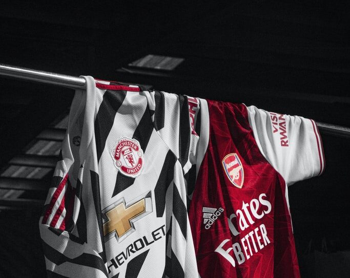
12. Man United
This shirt has had very mixed reviews on social media. Overall, I like the shirt it’s another one that is simple but effective. However, I think it is another kit that is worsened by the sponsor. Honestly, I think the kit looks a bit Sunday League but I blame this on the TeamViewer logo. I think with the Chevrolet logo from last season it would like nicer and more professional. I like the stripes the shoulders and the inside of the collar looks great. Another case of good shirt bad sponsor.
Welcome to a new era of possibility.
Welcome to a world that works better.Welcome, @TeamViewer ?#MUFC #BringingYouCloser pic.twitter.com/83y372oF62
— Manchester United (@ManUtd) July 15, 2021
11. Burnley
This is a nice kit but it is another that is too basic to be ranked higher. I love the sleeves on the shirt I think the diagonal patterns look great. This is similar to the West Ham kit but the cool sleeve design and the better collar push it up those few extra places. The sponsor suits the shirt well and is a decent size. I like that they have the old badge on the back of the neck as well. Overall, it is a traditional shirt which I like but there are nicer kits in the Premier League so it just misses out of my top 10.
We are Forever Claret.
Introducing the new 2021/22 home kit.@SpreadexSport | @UmbroUK | #UTC pic.twitter.com/HioTRBX9w9
— Burnley FC (@BurnleyOfficial) July 21, 2021
10. Everton
We move into the top 10 now and we start with Everton. This is a very nice shirt, I love the patterning in the main body of the shirt. I like the little bits of yellow around the neck and at the bottom of the sleeves as well. However, I’m not a fan of the chevrons on the shoulder I think they are a detail that wasn’t needed. Overall, it is a very nice kit but the chevrons stop me placing it any higher. Very harsh I admit but as we move into the top 10 there are a lot of nice kits so my rankings have to be more brutal.
What do you make of our new @hummel1923 home kit?
#AsOne ? pic.twitter.com/AdCoUy7mKg
— Everton (@Everton) July 9, 2021
9. Chelsea
This shirt is the complete opposite to the Tottenham shirt there is so much going on. I like both designs on this shirt a lot but I feel like they would’ve been better as two separate kits. I do like them combined but if Nike stuck with just one design this shirt would likely be in my top five. The yellow Nike swoosh looks great and I like the yellow down the sides as well. I would definitely buy this shirt if I was a Chelsea fan but there is just too much going on for me to rank this higher.
Our new @nikefootball Home Kit… ??
Inspired by the '60s Op-Art movement made famous in London ? The yellow trim, coupled with a more vibrant blue, injects a youthful feel that we can't get enough of. ? pic.twitter.com/znNIRc5NtP
— Chelsea FC (@ChelseaFC) May 13, 2021
8. Southampton
I like this shirt the more I have seen it. At first glance I wasn’t sure about the chevron patterns in the stripes but they have grown on me. I said the Brentford kit was a bit boring earlier and I think they should use this Southampton kit as an example of how extra design features can take a kit up a level. What drops this shirt down for me is the collar, I don’t like how one side cuts across the other. If they had met in the middle I would prefer it. Overall, I like this shirt a lot but the collar keeps it from ranking higher.
It's in our DNA ?
Thoughts on our new @hummel1923 home kit, #SaintsFC fans? ? pic.twitter.com/NcNuRLJICW
— Southampton FC (@SouthamptonFC) May 27, 2021
7. Norwich
This is the shirt that has surprised me the most. I’ve never really been a fan of Norwich kits because the yellow and green doesn’t really work for me but this kit is beautiful. For me this is the shirt with the best looking sponsor placement. The Lotus logo looks great on this shirt and it doesn’t take up too much room. It is another shirt that is simple but very effective. However, the sleeves put me off I don’t like the yellow stripes. Fully green sleeves and this shirt could have easily made top 5.
— Norwich City FC (@NorwichCityFC) July 10, 2021
6. Brighton
This Brighton shirt is another very traditional shirt and it looks fantastic. I would certainly be buying this if I was a Brighton fan. The blue and white stripes look brilliant and the American Express logo suits the shirt perfectly. Like on the Chelsea kit the yellow Nike swoosh looks great. I like the yellow band around the inside of the collar as well. This shirt is great and honestly I’m struggling to find a fault with it. It’s incredibly harsh for this to not make my top 5 but I just prefer the other shirts to this.
? Be-a-utiful.#BHAFC ?⚪ pic.twitter.com/VpcaIPXO2C
— Brighton & Hove Albion (@OfficialBHAFC) May 18, 2021
5. Man City
We enter the top 5 now starting with Man City. City are known for having weird and wonderful kits so this is very basic by their standards but this kit is still great. The patterned design looks amazing and the Etihad Airways logo sits perfectly on the shirt as always. The 93:20 on the inside of the collar is a very nice touch to mark 10 years since Sergio Aguero’s iconic title winning goal. My only issue is the white stripes on the sides I feel like it would look better just fully sky blue. This shirt would have been easy top 3 if not for those stripes.
Dressed for success! ?
? Shop now! ➡️ https://t.co/crf3MT49zU
? #ManCity | https://t.co/axa0klD5re pic.twitter.com/BazeaVApWx
— Manchester City (@ManCity) July 14, 2021
4. Liverpool
This is another shirt that has grown on me over time. I wasn’t sure about the orange where I first saw it but I am very much a fan now. Once again this is a simple but effective shirt. I like the diagonal lines going through the main body of the shirt. The Standard Chartered logo looks great and doesn’t take up too much space on the shirt. The orange on the neck and sleeves is a good edition as well. As a Liverpool fan myself I will certainly be purchasing this shirt but it just misses out on my top 3.
It's time! ?
? Introducing our new 2021/22 @nikefootball home kit ? pic.twitter.com/tNMSXmQ82q
— Liverpool FC (@LFC) May 20, 2021
3. Arsenal
This is a very nice shirt. There have been a lot of comparisons to Ajax kits on social media which I see as a massive complement as Ajax consistently have some of the nicest shirts in Europe for me. I love the white on the sides and sleeves. The red and white complement each other brilliantly and the Emirates logo looks great. I am also a big fan of the collar design. I’m still not quite sure about the blue on shoulders but it is growing on me more and more. I feel like once I see this being worn during a game it could be pushed up to second.
The Armoury: ???????? ?
❤️ @adidasfootball ? pic.twitter.com/0Vu3KrKQMv
— Arsenal (@Arsenal) July 16, 2021
2. Leeds
This shirt is the definition of simple but effective. It is another one that I was unsure of when I first saw it but the more I’ve seen of it the more I love. The all white looks fantastic and the sponsor suits the shirt perfectly. The yellow stripes on the shoulders look brilliant. I’m not usually a fan of buttoned collars but it looks great on this shirt. Leeds fans should be rushing to buy this. I realise that this could be controversial to rank such a simple kit so highly but I think this kit is outstanding.
#DifferentByDesign#LUFC x @AdidasFootball pic.twitter.com/4moAMUTWMM
— Leeds United (@LUFC) July 21, 2021
1. Leicester
Wow! That was my first reaction to this shirt. The design of this kit is top tier. The camo pattern throughout the shirt looks amazing and the FBS logo looks perfect in the middle of the shirt. The gold bands around the neck and bottom of the sleeves complement the blue and white brilliantly. This shirt is quite simply a thing of beauty. Every Leicester fan should be buying this shirt. I’ve never been someone to buy the shirts of teams I don’t support but I am very tempted by this Leicester shirt.
That completes my ranking of the 21/22 Premier League kits. Well done to Adidas for making this fantastic shirt as well as both the others in my top 3.
Introducing our ????? ??? 2021/22 @adidasfootball home kit! ? pic.twitter.com/wl6xMSd3PO
— Leicester City (@LCFC) May 23, 2021
We hope you enjoyed the article “Premier League Kits 21/22 Ranked”. Which kit is your favourite? Let us know!
Read more on football:


Why Data Literacy Is the Real Skill in Modern Sports Betting

Essential Tips to Improve in Pole Vault

October’s Triple Play: Betting Across Football, Formula 1, and Basketball

The Rise of Mamelodi Sundowns: How One Club Dominates South African Football

What is the Fastest Tennis Serve of All Time?

The Best Penalty Takers of All Time

Best Retro Football Shirts Ranked

The Biggest Derbies in British Football
-
 Football9 months ago
The Best Penalty Takers of All Time
-

 News9 months ago
The Fastest Rugby Players Ever
-
 News12 months ago
The Best Male Tennis Players of All Time
-
 News12 months ago
Joe Solecki: Fighters At A Glance
-

 Uncategorised12 months ago
What Dinosaur Has 500 Teeth?
-

 Horse Racing12 months ago
Cheltenham Festival Tips: Sporting Ferret’s Best Bets for Day Two of the Festival
-

 Football12 months ago
10 of the most underrated footballers in the world right now
-

 Football10 months ago
Players with the most goals in a Premier League season